
Multi-tasking: (noun) "the carrying out of two or more tasks at the same time by one person."
Well, I've been kicking myself for weeks to get back to blogging more regularly and need to scare up inspiration for a client's living room, featuring a color scheme that is a little scary itself, so this blog post will satisfy multiple tasks in this same late(ish) hour on a beautiful Monday night. Nice!
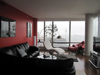
As I've posted in the past, I'm not the biggest fan of red. But my client hired me several months after an odd selection of paint colors were rolled across every wall so foundational color scheme choices were not mine to make. And, hey, I do like a challenge. She toured me through a living room emblazoned in red accent walls, opposite vast views of the Hudson River through curtain wall glass windows. It hardly works, but the damage was already done. And she loooves the red wall, so I zipped my mouth shut. She was able to admit, however, that the black leather sectional along the wall had to go. Thank God. 1982 was a long time ago.
With these givens in place, we hatched a red and gray color scheme, much warmer and current. The red wall is Benjamin Moore's aptly named "Red" and the only other element I'm forced to work with is the funky red leather chair in the photo below. To warm it all up, we picked a gray with loads of brown undertones, building from the Roche Bobois Script Sectional, also pictured below, to layers of accessories that tie it all together.

Images above:
1. Bold doses of red against a gray backdrop (found on www.homesinterior.net) which is the exact opposite of what I'm working with but helpful nonetheless.
2. Better proportions of red and gray, with an unexpected dash of yellow in the window casings (found on www.shinyinteriors.com), although my client would sternly prefer I not introduce any other colors. Tough one, but OK.
3. Now we're talking....the downtown LA loft of Harrison Ford's son William with pops of red, consistent gray, and natural wood and wicker tones (from The Telegraph).
4. Lipstick red furniture seems to harmonize most naturally with bold pop art and lots of white.
5. My client's living room as I found it (I'll post "after" images in another month or so, because boy is it going to be different!!)
6. The warm gray leather Roche Bobois Script sectional that is replacing the black bachelor pad special above.
7. Hide & Batik carpet tiles from FLOR come in a warm gray and white color way, perfect for adding a touch of pattern but practical enough for a family and a dog.
8. This affordably large giclee from Z Gallerie called In Bloom features the bold red, but introduces lots of white and other warm complimentary colors.
9. Red and gray hand-sewn and screen-printed pillows, crafted from eco-friendly hemp and nontoxic dyes (from Cloth & Ink on Etsy).
10. West Elm's Martini Side Table (we'll be using white or silver beside the corner chair because the red version is too orangey for this room).
11. A pop of red in a functional piece: cb2's Three Prong Red Coat Rack.


